 Click for Code
Introduced Reusable components library and design system for multiple product teams
Published on June 31, 2026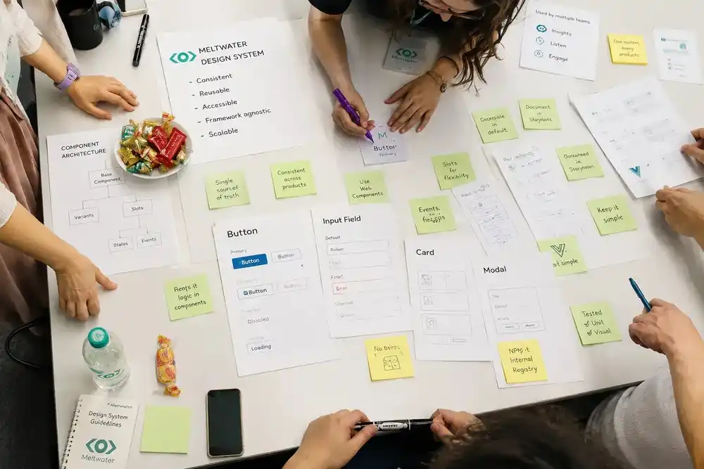
Project Overview
Meltwater is a social media intelligence platform where teams create, publish, and analyze content across many social accounts. The product is not a single app. It is a suite of products, and each product was owned by a different team.
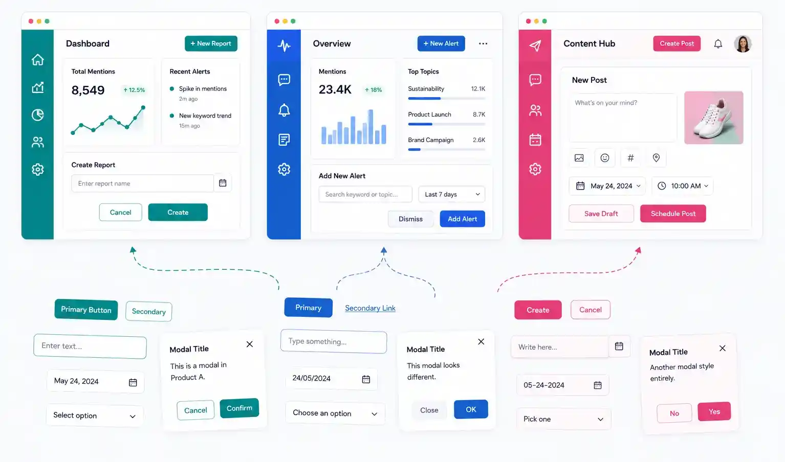
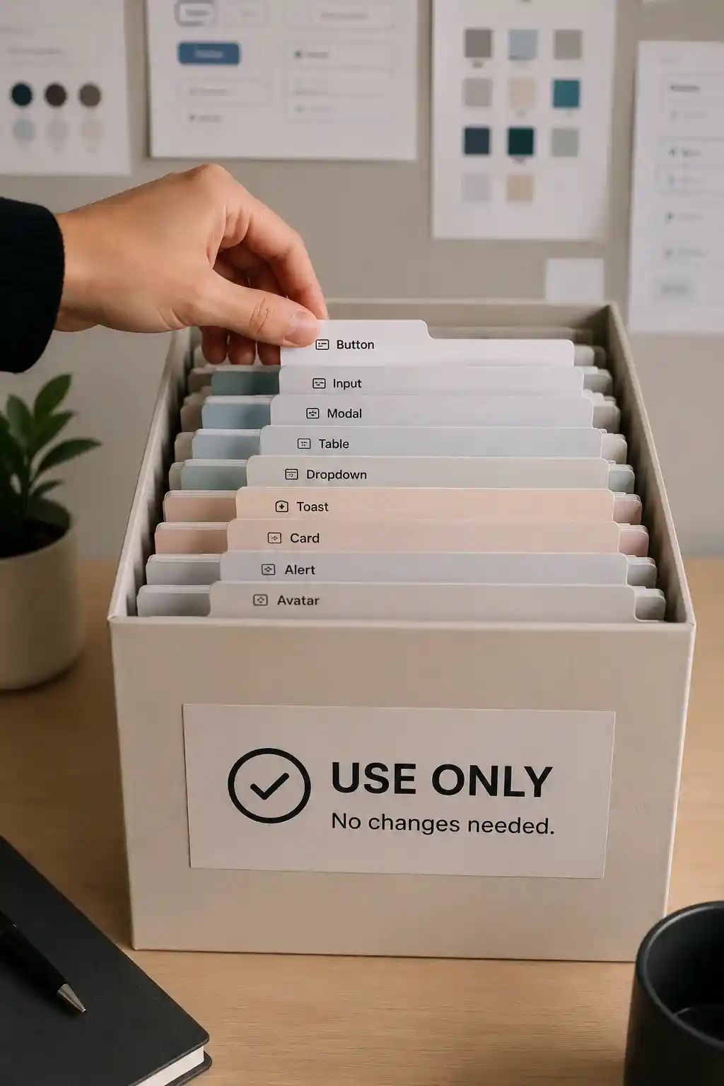
Over time, each of those teams had built its own frontend in its own stack. The same building blocks, buttons, dropdowns, modals, inputs, and other common UI, existed in several places, written again for each product. There was no shared source for any of it.
This caused two problems. The UI looked and behaved differently from one product to another, and it was hard to keep standards consistent. Every component was tightly coupled to the product it lived in, so a fix or a design change had to be repeated everywhere, which added up to a lot of duplicated effort and tech debt.
Process
We decided to build one shared library that every product team could use, no matter which framework their product was written in. To make that possible, we built the components as Web Components using Stencil.js, so they could run inside any of the existing apps without forcing a rewrite or a common framework.
Each product consumed the library in two steps. First the component bundle was loaded into the app, and then the components were registered as custom elements before they could be used on a page. This kept the integration predictable across very different products.
The most important design decision was to keep the library loosely coupled. We relied heavily on slots instead of props, so consuming teams composed the UI they needed and we kept business logic out of the components. Components stayed presentational and did not carry any product-specific assumptions.
For anything interactive, components communicated through emitted events rather than callbacks passed in as props. This gave each team the freedom to decide what happens on their side, and it kept us from baking tight business logic into the shared layer.
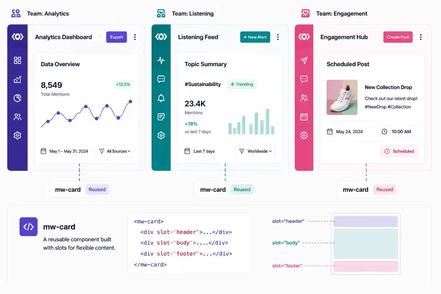
The same components composed with slots across different product teams.
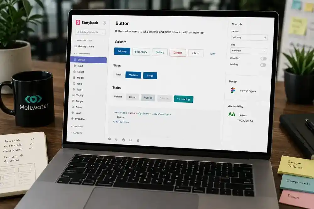
Documented every component and its variants in Storybook.
On the release side, we published the packages with semantic versioning so teams could see exactly what changed between updates and upgrade safely. The components were published to an internal registry as well as the public npm registry, which made both installation and updates consistent for every team.
We documented the whole system in Storybook so teams could browse components, see their variants, and understand how to use them without reading the source. To keep quality high as the library grew, we backed changes with unit tests and used Chromatic for visual regression checks, so an accidental UI change was caught before it reached a product.
Outcome
Teams stopped rebuilding the same components in parallel. New pages looked and behaved consistently even when the underlying products were built on different stacks, and the design standards were finally shared instead of copied.
The loose coupling paid off in maintenance. Because components held little business logic and communicated through events, fixes and improvements landed once and rolled out to every product through versioned releases instead of repeated one-off patches.
This reduced the frontend tech debt across the suite and made it faster for teams to build new features on top of a reliable, well-documented base.
Tech Used
Web Components built with Stencil.js, published via npm, and integrated across Vue-based product surfaces.
Got a clear picture so far?
If you're wondering whether we are a good fit for your project, a quick 15-minute call can help clarify the next steps. Book a Quick Call NowWrite To Us At Your Own Convenience
What People Say
Shaped by years of experience, our stack includes React, Next.js, TypeScript, Node.js, Python, robust databases, and top-tier cloud services - chosen for stability, scalability, and clean engineering practices.

“It’s been such a pleasure working with Parmeet. We’ve been impressed by the quality of his code, his communicativeness, his work ethic, and his passion for making the product intuitive and delightful. We’d recommend him enthusiastically to others and hope to work together again in the future.”

“I worked with Parmeet for half a year, and I can highly recommend him as an experienced front-end developer and a responsible team member. He can quickly understand an issue or a new codebase and provide a solution.”

“I got the chance to briefly work with Parmeet and I must say that I enjoyed every single second of that. He is one of the few people (I’ve worked with) who have a zeal to learn more, can quickly adapt to new technology, is a fast learner, highly productive and more important is honest and humble.
He has got a very pleasing personality and is very presentable.
Parmeet is self disciplined, can manage and plan his time very efficiently and can deliver tasks on time.
I would like to recommend him as a Full Stack Developer (JavaScript) who can deliver polished front end applications on ReactJs that are backed by equally capable backend developed in NodeJs (deployed on AWS Cloud)
People like him are an asset to any team.”

“He is a hard working individual with good insight into what makes UX work for the end user. A joy to work with.”

“We brought Parmeet onto our team to accelerate development of a new product, and he definitely delivered. Parmeet immediately took ownership over all the stories we assigned to him, thinking carefully about the user experience and ensuring that the components he built would function well on both desktop and mobile. He was also an excellent collaborator, eager to share ideas for how we could improve the product and receptive to feedback on his work. Thanks to Parmeet, our MVP release was smooth and on schedule. We will definitely keep him in mind for future projects!”

“I had the pleasure of working with Parmeet on the same team at Meltwater, and I can confidently say that he is one of the best engineers I’ve worked with. Parmeet brings an exceptional level of attention to detail, a deep understanding of software engineering, and a curiosity that inspires overall team improvements.
He approaches every sprint with a holistic mindset, considering not just the immediate implementation but also the broader product impact. Parmeet consistently contributes thoughtful design suggestions and explores alternative approaches, clearly outlining trade-offs and helping the team make informed decisions.
He’s not one to shy away from challenges and frequently demonstrates leadership through initiative, insight, and collaboration. His ability to balance technical depth with product thinking makes him an invaluable asset to any engineering team.”

“Parmeet is an all-star frontend developer and a great teammate. I’ve worked with him on multiple features, and he consistently delivers thoughtful ideas, timely solutions, and pixel-perfect, scalable UI. I’d gladly work with him again!”

“I worked with Parmeet at Jiffy, and he is a dependable frontend developer who delivers high-quality work. He writes clean and easy-to-maintain code and always focuses on good user experience and performance. Parmeet is skilled in JavaScript, TypeScript, React, and modern CSS (SCSS, Tailwind). He works well with the team, takes ownership of his tasks, and can be trusted to deliver. He would be a strong addition to any frontend team.”

“I really enjoyed working with Parmeet. Highly recommended for React-based web development projects with the rich user interfaces.
He is eager to learn and improve in all areas. He has excellent communication and technical skills. He is hard-working, ensures deadlines are duly met, and never compromises with product quality.”

“It was our pleasure to work with Parmeet. He worked on creating the online identity of our business. He got not just the development of the website done but got the copywriting and product photography work done as well. The website created by him is fast and responsive. It has helped us land many new international clients and increase our sales by a whopping 25%. I would strongly recommend hiring him.”

“It was a pleasure to work with Parmeet, an honest and reliable Dev!”

“Parmeet was my junior at classic informatics and we have worked closely on numerous task alongside. His attention to detail and eagerness to learn sets him apart from anyone that I have worked with.
Parmeet’s ability to handle any challenge thrown at him with utmost level of calmness and sincerity makes him an asset for organisation. When it comes to front end I have never seen someone so excited about the things they are developing, Parmeet is keen to make a noticeable impact on anything he picks up.
He was an remarkable colleague and I still miss working with him. As a lead, Parmeet earns my highest recommendation.”

“Parmeet is an excellent developer and a great friend, he is really good in React and has been a real gem to our last company. His technical skills are impressive as per his experience. He always makes sure to meet all the deadlines within a given time frame & with the top standards. He is hardworking & dedicated in his work. It is a pleasure and honor to recommend Parmeet to anyone who wants to hire him.”

“I am pleased to write a letter of recommendation for Parmeet Singh. I highly recommend Parmeet Singh to your organization.
I have known Parmeet Singh for the past 3 years as he was working with me in the same project at Classic informatics. During our time together, his collaboration and leadership skills were truely impressive, and his UI & design work on a project won glowing reviews from peers and client both.
Parmeet Singh is well equipped to grow from challenges that he is presented with. His strong computer programming skills prepare him beautifully for your company. I strongly endorse making Parmeet Singh a member of your team.”

“There is no better colleague than Parmeet. He is one of the most dedicated professionals I’ve worked with and is willing to put that extra help whenever you need it. His expertise as a developer is considerable, and it helped our team come up with more efficient solutions on different projects. He is a great asset to our company.”

“Parmeet is a good and technical sound is his work. I worked with him on 2 projects and he developed the project proficiently on frontend and backend. I hope to get work opportunities with him in future so we can connect the world together for the betterment.”

“I worked with Parmeet in Credit Culture. He possesses great abilities in UI/UX. He always brings new ideas to the table and shows great dedication to work. He’ll be a good addition to any team.”

“I’ve worked with Parmeet for short period of time. He is very skillful frontend developer. He don’t limit himself to one thing always love to explore new things and share with others.”

“He is a good coder and has a humble attitude. His work quality is really good. I got a chance to work with him and we both learnt a lot.”

“Parmeet is a creative developer with fantastic eye for unique and innovative designs in addition to his great problem solving skills and zeal to be acquainted with new inclusions to JS.
He is an excellent team player who can outshine independently as well.”
Let's Bring Your Next
Big Idea to Life
Whether you're brainstorming ideas, looking to bolster capabilities, rapidly expanding your team, or delegating
projects, count on us to meet your needs effectively any or every step of the way
OR
Write To Us At Your Own Convenience